Tuesday, 29 March 2016

Creature Design - Predatory Horse

Overview

Predatory horse, designed to look vaguely familiar and thus subvert initial responses. It travels in herds and controls huge territories encompassing forests, plains, and ravines; there are very few creatures that would dare attack them. In general, the most dangerous thing to a predatory horse is a challenger to the herd's leader; this is why they have huge ridges of bone that protect their eyes, and thick scales that protect the vulnerable neck and spine, defence from the thick tusks protruding from their mouths.

[At this time, the predatory horse species has no name.]


Inspiration

Creatures:
  • Horse
  • Gnu/Wildebeest
  • Warthog
  • Lion
  • Rhinoceros
  • Cassowary
  • Crocodile
  • Iguana
  • Pit Viper
  • Burmese Python
  • Hippocampus (Fantasy)
  • Qilin (Fantasy)
  • Triceratops (Extinct)
  • Terrorbird (Extinct)
Disregarded:
  • Sivatherium (Extinct)
  • Megaloceros (Extinct)
  • Cockatoo
  • Bear
  • Lionfish
  • Harpy Eagle
  • Porcupine
  • Shadhavar (Fantasy)

Process

Like the sharkdog, I had trouble deciding on what direction to go with this creature. I'd envisioned multiple horns on its head, like Sivatherium, but not of the sketches I made with this in mind made it appear like a successful predator. Likewise, the lionfish spines, porcupine quills, and cockatoo crest (all to deter predators) made little sense when I wanted this creature to be powerful and feared. Thus, I began to look in different directions for inspiration, including often-overlooked animals like the warthog and the cassowary.

Collection of initial headshots. Multiple horn solutions, though not appear predatory. Once a more beaked, rhinoceros-like mouth was referenced for the more natural tusks, everything flowed a lot better.

Side-view. Figuring out body type (horse, wildebeest, lion) and feet. The raised legs were to judge how the clawed feet would look in both positions, and see if it seemed natural. The fourth design was referenced properly from a similar horse pose once things were finalised.

Added a better eye-covering protrusion in the skull. Manes: first design is inspired by a qilin statue, second is crocodilian scales, while the third is more fjord horse/zebra. The fourth is more horse based, but takes the best from the previous ideas.

Chosen side-on pose, with correct mane, eye-covering protrusion, and crocodilian scales. The front view sketch was to keep all the proportions in mind of the various protrusions - both bone features and tusks.

Eventually the front-on sketch was necessary (for my MA poster) and evolved into a more action-based pose. The first was discarded as it didn't give the impression of a predator, whilst the final one, mid-run, looks more imposing and hunter-like.

Final designs.

Design Notes:
  • Heavy, three-toed feet made for powerful, bone-breaking kicks and fast running, not gripping onto prey (like cassowary/terrorbird)
  • Scales for protection against attacks, generally from other horses - thicker ridges on scales covering spine/neck for added protection
  • Long tail tipped with fur to whip away flies when bloodied
  • Thick plate over masseter jaw muscle (inspired by iguana)
  • Strong, thick bone structures protruding around sunken eyes, to protect from stabbing tusks
  • Additional, small nostrils lining the overly-wide nasal cavity, for drawing deeper breaths when sprinting
  • Partially reflective scales, slightly iridescent in various primary colours - useful camouflage in foliage, though they don't tend to use it for ambush predation
  • Sharp, horizontal tusks used to hack into prey with a vicious side-swipe as they run alongside, inflicting dangerously deep wounds on each hit - tusks are also serrated so they cannot easily get stuck in flesh/muscle
  • Tusks used for hunting prey, stripping bark from trees for additional food source, or for combat, typically when wresting control of a herd (eyes/neck would be a disastrous point to injure, thus the increased defences on both)
  • If humans could successfully domesticate them, they would find the horses to be extremely loyal and protective to their trusted partners, as well as very social
The scales of this creature in the final stage were extremely tedious to create. I used a downloaded snake-scale texture brush to give a semblance of texture on the first colour pass, but the actual detail stemmed from looking at reference images of iguanas and crocodiles. The second, front-facing horse was somewhat faster as I utilised the clone tool and took a base from the previous horse to build on, though it still required a lot of fixing up.

Reflection

  • Focusing on headshots at the start made the design process faster
  • Looking for wider inspiration and trying new ideas in each headshot added to the final design
  • Again, having a broad understanding of what the creature would be like - predatory, unlike its main inspiration - made decisions of what creatures to involve a lot easier
  • Drawing over a previous sketch on a lower opacity layer to carry over a basic idea is definitely a useful technique
  • Clone tool allows basic textures to be copied, definitely not acceptable to leave them untouched afterwards though, they need fresh details
  • Scale textures are tedious to create, but are worth the time and effort. I'll probably try them again on another creature to see if I can refine the process a little more
  • Action pose was very interesting to draw as I made it a little while after completing the original side-view, and had to reference all my notes again to make sure I didn't forget any design points

Monday, 28 March 2016

Creature Design - Suki

Overview

Shark/dog built around the idea of it being incredibly happy and overly friendly, though it looks intimidating. It would charge at humans full-speed; those who knew of them would be fine with their companionship as they are excellent protectors and scavengers, but those who were scared would kill them off. This doesn't stop them - they charge vehicles and transport too if they see humans. All they want is acknowledgement and companionship.

Suki is colloquial shorthand from their homeland, and stands for 'suiciders', due to this oblivious, fearless behaviour of running under cars.

Inspiration:

Creatures:
  • Staffordshire Bull Terrier
  • English Bull Terrier
  • Tiger Shark
  • Great White Shark
  • Blue-Tongued Skink
  • Andrewsarchus (extinct)

Process

This creature was difficult to pin down a design for initially, as I didn't decide upon the creature's role or behaviour; it was merely a shark crossed with a dog. Once the idea of it being friendly occurred, designs became much more dopey and good-natured, making sure that even though the creature looked stocky and intimidating, it could also look like a silly puppy, so that viewers could easily tell it had a warm personality under the more vicious exterior.

Initial sketches. The first design (top left) looks almost pig-like, and thus exterior ears were removed entirely in subsequent designs. The tail also did not fit well. However, stocky bodies and strong front legs were a consistent theme. The final design, with more of a neck, looked much more natural and realistic as a creature.

Colour idea, with sketches exploring the dopiness of the creature's behaviour. The leaping one has a wide, open mouth, reminiscent of both a shark and the staffie's wide smile.

Final design: two of them playing together. Smiles are clear; they do not appear ferocious in mannerism.

Before I moved onto the final design, I watched R.J. Palmer draw realistic pokémon on youtube, and utilised one of the techniques he used to add texture to the dog's skin - he added magenta, cyan, and other bright colours on Colour Dodge/Lighten with a textured brush to give the effect of fur when partially erased. The dog's multi-tonal skin is the product of clumsily experimenting with this technique. Additionally, the faded parts of the creature to show depth are a technique picked up from his videos, as is the silhouette of a human for scale.

Reflection

  • The silhouetted character to show scale of the animal is extremely useful for keeping things in proportion, and keeping the design correct for its size
  • Textured background adds some interest, and is great to sketch on
  • Still using a red brush, though darker than the last project
  • Texture brushes are fantastic for adding personality to a creature quickly
  • Side-on poses work for displaying the creature's main features, while more interesting, developed poses show the creature's personality
  • Next step would be to redraw the creature in a proper environment amongst others in the world

Wednesday, 16 March 2016

Not Dead

Neglected this blog in favour of research and poster-work in recent weeks, so there's quite a bit to update:

Current Inspirations

  • Ross Tran
    • Has high-energy speedpaint commentaries on YouTube
    • Uses inspiring/interesting photos on layers like Overlay, Multiply, and Soft Light, using Colour Balance and the Warp Tool to change them into more textured images that add something to the piece without being overbearing
    • Has a loose, painterly style with emphasis on composition
  • R.J. Palmer
    • Known as "the artist who painted those realistic Pokemon"
    • Has speedpaints on YouTube - one of the processes I noticed is the Colour Dodge/Lighten layer used to add skin/fur texture with cyan/magenta/bright colours
    • Sometimes streams his process - bounce light was the focus in the part I watched. Animals and realistic anatomy form the backbone of his illustrations
  • Daren Horley


Current Processes Used

  • previous sketches on low opacity beneath/near newest sketch
  • previous sketch used as a basic guide for the next one
  • grunge paper/parchment background (Daren Horley)
  • dark red brush for sketches (Feng Zhu) - use darker red for neater lineart over the top
  • reference images on page (Feng Zhu) - more tendency for them to run along the top of the page than the side
  • texture brushes (Aaron Blaise, Aaron Griffin, Charlie Bowater)
  • texture brushes used on Colour Dodge/Multiply layers (RJ Palmer)


Catch-Up

To begin this project, I thought of the basic world and environment, and what might live there, as a prelude to my actual work. Essentially it consisted of a forest with lakes/oceans on raised plateaus, and a savannah with a nomadic civilisation. Technological advancement would be at the same level as our world, as I didn't want to fall into the trap of alien worlds being hugely futuristic and fantasy worlds being caught in an obscure medieval era.

I added the creatures I thought of (each built of up to five animals) to an excel worksheet to organise them, and began drawing a couple. I also tried to draw the creatures that built up said animal, but it was a very lacking task and I quickly gave it up:

First Excel worksheet and a failed diplocaulus/fu dog creature.


Instead, I began drawing environments using the thumbnail technique again (though I intend to research into other environment processes, if only a little). The world evolved into more colour and vibrance, with multiple standing rock platforms and lake plateaus. Essentially, the world is full of lakes, rivers and oceans, and this altered my perception of the creatures I had stipulated. Thus, I dropped the previous creatures and instead made a list of the animals that I was interested in combining:
Thumbnail environment. Hazy landscapes broken by trees, rock formations, and lakes.

Current worksheet (as of 16/03/16). Each creature is colour-coded into the end column, meaning it is used in that creature (names are typically made of an amalgamation of the inspirations).


By having a more open-ended view of what could build each animal, I found it a lot easier to design things. Whenever there was a hard decision to be made, or too much choice, I kept a main thought in mind for each creature, and let it lead decisions. For example, my first creature combined a shark with a Fu Dog - it was becoming more and more vicious looking until I decided it should subvert expectations and be incredibly friendly. This made the design more bouncy and dopey looking, with a wide smiley mouth, even though it still appeared stocky and intimidating.

The idea of subverting expectations actually fed into the following designs, too. My horse creature is predatory (and actually began looking like a t-rex towards the end). Another creature, my otter/seal, lives on the beach and plays with everything it finds without a care (actually inspired by watching my staffie play on the beach). It would also be very family-oriented and protective.


TL;DR:

I figured out that my creature designs should not be restricted in choice of animals, and should follow a guiding theme to define their design/personality.


Monday, 4 January 2016

Creature Design - Wrap Up

Creature Design #10

Overview
Decided to revisit Feng Zhu's technique with red brush lineart, and design a disfigured monster.

Research/Inspirations

  • Ludwig (Bloodborne boss)
  • Envy's true form (Fullmetal Alchemist character)
Process
I drew a few loose designs, with no real idea to tie them together other than multiple limbs or eyes, or faces screaming in its flesh.

As I drew each small design I moved it to the edge of the screen, and eventually I began to see more designs in them overlapping than otherwise.

Each design was distinctly different, but so much so that I couldn't break down the design into elements I wanted to keep. The design floundered and I left it alone.

Reflection
  • Without a basic direction, drawing aimlessly with lineart sketches is not the most efficient process
  • Silhouettes might be best, like with the Gravestone Beast I designed
  • Piling up lineart was unusually useful for this complex design, and gave interesting ideas - might be something to test later


Overall Reflection of All 10 Creature Designs and Artist Processes
  • Silhouettes are very commonly used in different design approaches
  • Lineart tends to work best with a more distinct idea, and to flesh out chosen silhouettes
  • Using photo textures to enhance sketches gives a faster view of what the finished product might look like, and saves wasting time hand-drawing it in case it isn't chosen
  • Simple backgrounds can be enhanced with small details like fog, keeping attention on the creature
  • Varied line weights in line art makes it more interesting and hints at shadows
  • With traditional sketches, brushpens help for silhouettes, and watercolours are exceptional for figuring out a colour scheme as it restricts colour choice and makes each decision count
  • Research and reference images are key, especially kept on the page when drawing
  • Visual libraries count for a lot - I think the reason I had trouble with the last design was because it didn't fit anything I had drawn before

Potential Next Steps:
  • Find out what is best to have in a visual library for the most interesting creature designs
  • Explore combinations of creatures to apply visual library to (i.e. bison/cat, dog/oryx)
  • Look into mythological creatures and analyse the most common themes (i.e. wings, four legs) of popular and obscure creatures

Creature Design - Gravestone Beast and Daren Horley

Creature Design #9

Overview
Developed from a small silhouette I particularly liked, turned into a living/animated statue creature, carved by villagers as a protector that awoke in nightmares and turned on its creators.

I read an article featuring concept art, and the process thereof, of one of the creatures from 47 Ronin. Daren Horley was the artist responsible and his process was explained in the article, so I thought I'd try it. It involved silhouettes, and then greyscale mockups of a final design, with an hour or two spent on each one, before the final thing. Something I didn't try was using a parchment/paper texture to sketch on, to make it more interesting than a blank colour.

Research

  • Daren Horley's article on Creativebloq
  • Nightmare Frontier area on Bloodborne, for tombstone texture references
  • Rock textures (for an overlay layer)

Process
Digital silhouettes based on the idea caused by the top one (from my sketchbook). Looking for a shape for a statue/gravestone nightmare monster.


I took my favourite five silhouettes to the next stage, drawing details in grey over the top. The top two on the left have no overlay texture. By the third, I realised I was spending too much time on gaining an effective rock texture, so I overlaid a texture from google images on low opacity to add necessary variation much quicker. The two rightmost images were put together from amalgamating the best of the previous five designs.


The final image. A walking statue, carved like the gravestones, made as a protector. It bleeds gore from broken stones. Its limbs are covered in moss, mud, and blood.

Reflection
  • My favourite outcome of all of the recent creature designs
  • Using a photo texture in a sketch stage meant there was very little left by the end piece - normally I dislike using photo textures but this one was exceptionally useful and I may do it again in a similar case
  • Horley's method needs testing again with something less greyscale in the end result
  • Spending a few hours on each potential creature meant they were more developed than normal - it took time, but every detail added on them aided the final design
  • Small digital silhouette, scaled up, are easier to make than large ones straight off
  • Very good method for fleshing designs out first, instead of developing details later on


Sunday, 3 January 2016

Creature Design - Werewolf and Hunter, and Andrew Mar

Creature Design #8

Overview
More a change in dynamics than a brand new creature - a hunter and a werewolf working together to hunt beasts.

I looked into Andrew Mar's ink style for this as a more viable alternative to Natalie Hall, as it seemed more doable. He has a skill for placing shadows in the ideal place in lineart drawings and it gives the image a great deal of impact.

Research

  • Andrew Mar's instagram
  • Bloodborne hunters (images)
  • Humans posed facing away (image references for proportions)
  • Wolves snarling (images)

Process
 
The idea was already fairly solid, and explored in previous sketches. These were to find a viable pose to display the relationship between the hunter and his acquired pet.

Chosen pose. They would fight at close quarters, with the werewolf lunging and being pulled back. The chain would eventually snap, so the werewolf would attack with claws from one side, and the hunter would use the remaining chain as a whip. The hunter's design is worn and ragged, showing his strength in surviving his monstrous pet.

Reflection
  • Gives a variety of line-widths to make the image more interesting
  • Can give a suggestion of shadows
  • Time-consuming, gives neat line-art
  • Took a while to find the pose, silhouettes are extremely useful in that regard
  • Waste of time if the final pose looks off or wrong


Creature Design - Church Griffin and Natalie Hall

Creature Design #7

Overview
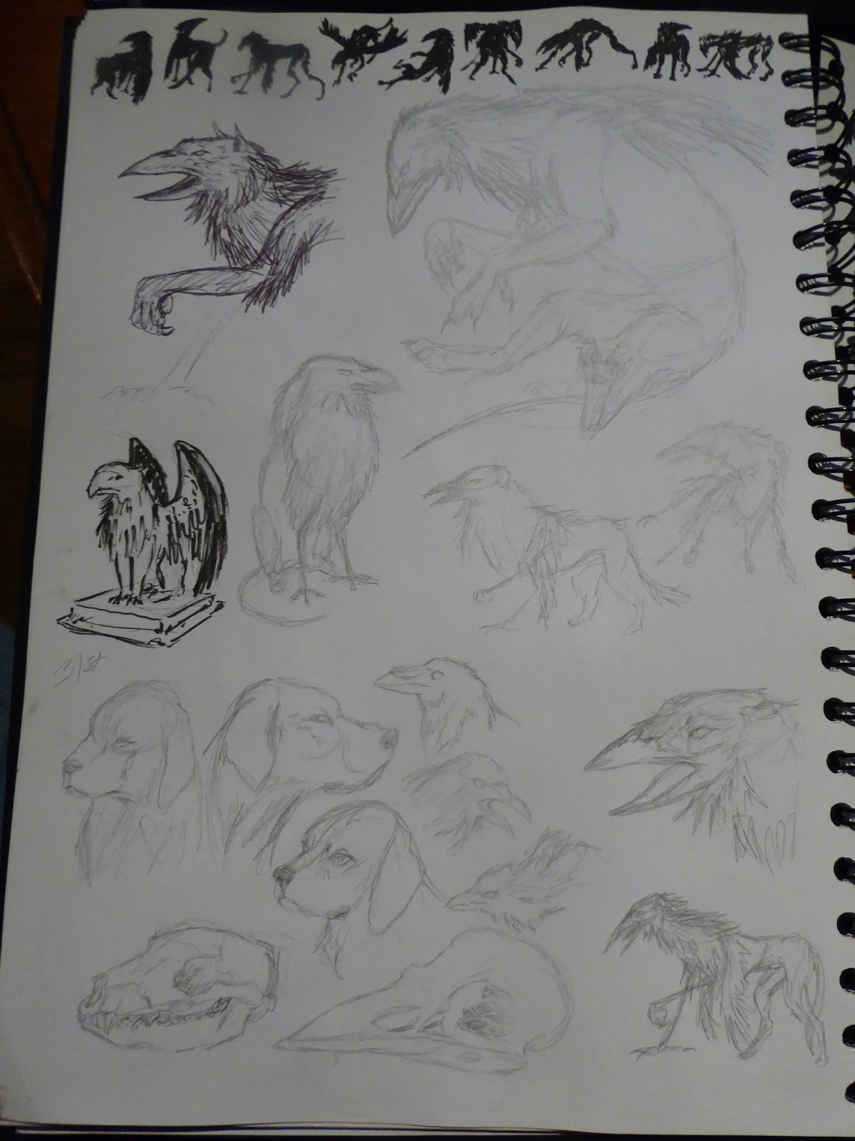
In the Cathedral Ward of Bloodborne there are small griffin statues on pedestals, but the closest an enemy comes to that form is an obviously created dog with the head of a crow; my creature idea was a visible amalgamation of parts into a griffin-like animal, presumably failed and disturbing, and hidden away from the public.

The chosen artist was Natalie Hall, a tattoo artist who often posts animal sketches on her facebook page. She uses pencil and ink, and the results are normally fluid, exaggerated and sometimes in abnormal poses. During my initial sketches for ideas I drew a few creatures in the same kind of style and I thought it might be interesting to expand upon those.

Research

  • Natalie Hall's instagram
  • Fox hounds
  • Crows, ravens, and their skulls

Process
Initial exploration. Since the environment is typically a Victorian-style city, it seemed implausible for there to be lions or eagles. Thus, my ideas stayed with what existed in abundance in the world - dogs and crows.

I tried to use biro like Natalie Hall, which I quickly dropped in favour of pencil again. The small statue is a quick study of an in-game screenshot so I could get a feel for the creature I was designing, imagining the mindset of those who would be making it in the world.

Resorted to brushpen for quicker layouts for an end pose, as it helps me see the overall shape better than pencil lines do. Additionally, drawing in pen means each line counts, and has to be thought through a little more than pencil, as pencil has the option of being erased.

Several of the creatures are consigned to boxes to try and replicate Natalie Hall's style. 

Some poses worked well for forcing a sense of character (in particular, the one throwing feathers, and the one sat on its haunches), but they didn't work overall for displaying a creature's design, though it might be the wings that were at fault. Wings couldn't be folded on its back as it would hide too much of its body, but outstretched didn't fit in the constrained poses. 

The design developed at this stage, also. I went back to pencil, and then drew over it with a thinner brushpen just for line variety. The beak became more combined with the dog's skull, more in proportion with the placement of its nostrils.

Picked the best poses from the previous page and enlarged them, with more detail.

Final design for the Church Griffin. Deformed dog skull protruding into a muzzle, skin pulled back to the back of the jaws, feathers developing into a mane, wings too small to carry the creature in flight, and large crow-like fore-feet. Probably a mixture of hound bays and crow calls for its cry.


Reflection

  • Monochromatic designs don't give the same impact as coloured versions
  • Pencil/pen work great for sketches
  • Different poses, especially constrained to a small area, make for visible personalities in the creatures
  • Multiple sketches really help to develop a design
  • Basing the design in the world and using what would be available (for a chimeric creature like this one) helps to give a more realistic outcome