Monday 4 January 2016

Creature Design - Wrap Up

Creature Design #10

Overview
Decided to revisit Feng Zhu's technique with red brush lineart, and design a disfigured monster.

Research/Inspirations

  • Ludwig (Bloodborne boss)
  • Envy's true form (Fullmetal Alchemist character)
Process
I drew a few loose designs, with no real idea to tie them together other than multiple limbs or eyes, or faces screaming in its flesh.

As I drew each small design I moved it to the edge of the screen, and eventually I began to see more designs in them overlapping than otherwise.

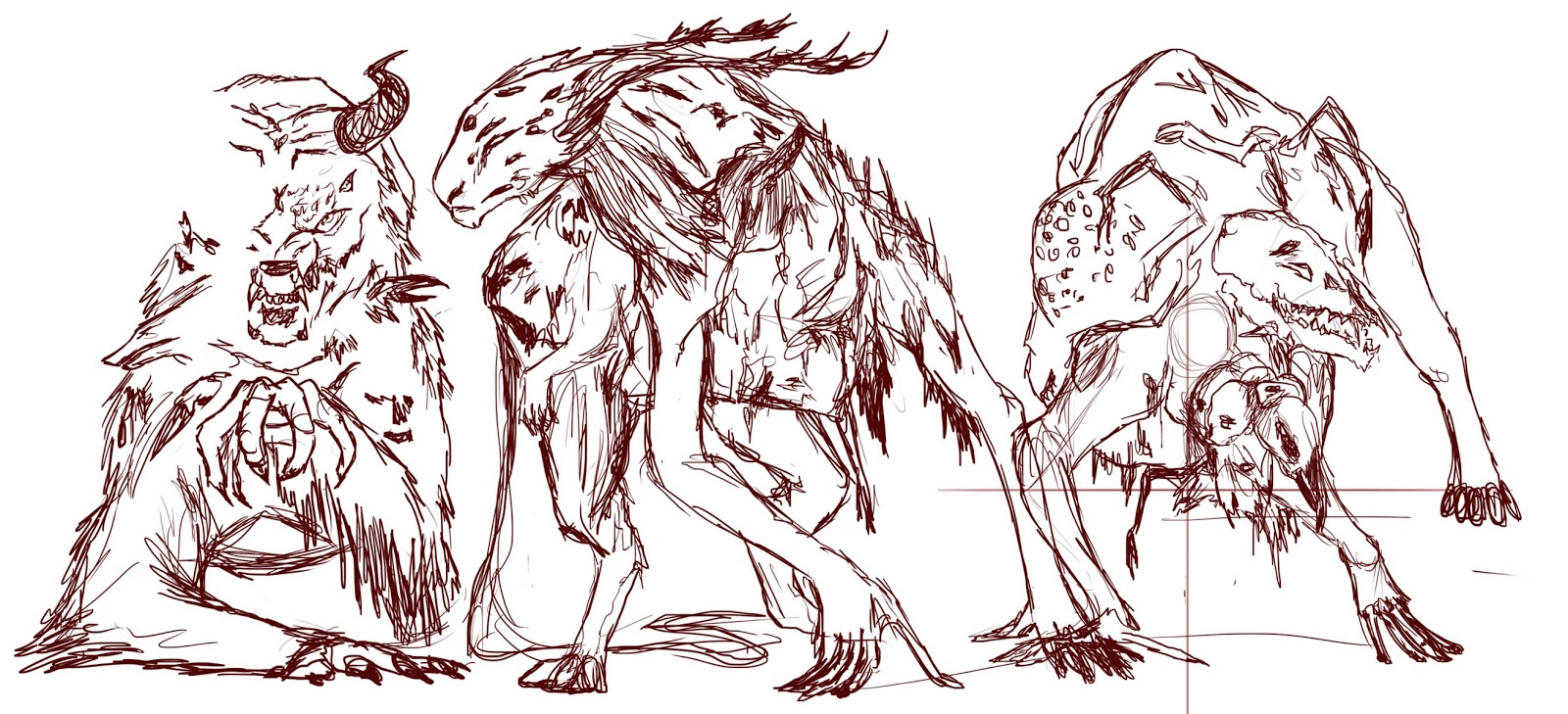
Each design was distinctly different, but so much so that I couldn't break down the design into elements I wanted to keep. The design floundered and I left it alone.

Reflection
  • Without a basic direction, drawing aimlessly with lineart sketches is not the most efficient process
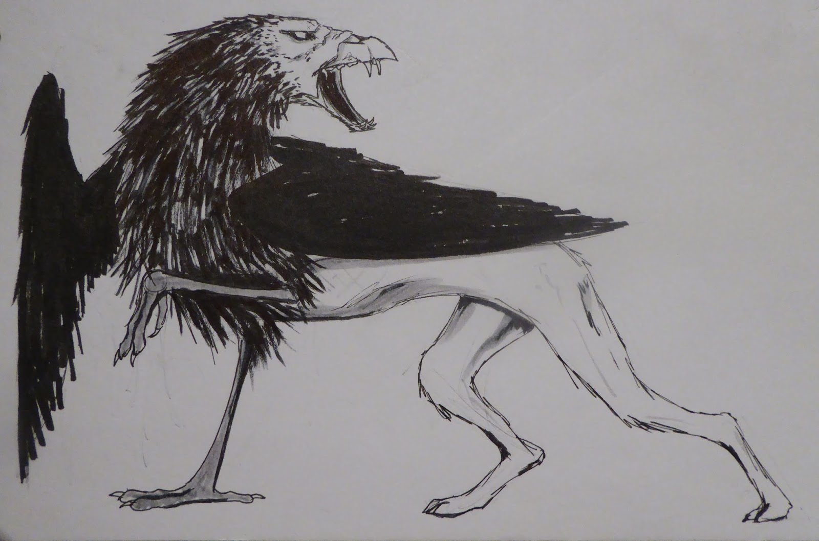
  • Silhouettes might be best, like with the Gravestone Beast I designed
  • Piling up lineart was unusually useful for this complex design, and gave interesting ideas - might be something to test later


Overall Reflection of All 10 Creature Designs and Artist Processes
  • Silhouettes are very commonly used in different design approaches
  • Lineart tends to work best with a more distinct idea, and to flesh out chosen silhouettes
  • Using photo textures to enhance sketches gives a faster view of what the finished product might look like, and saves wasting time hand-drawing it in case it isn't chosen
  • Simple backgrounds can be enhanced with small details like fog, keeping attention on the creature
  • Varied line weights in line art makes it more interesting and hints at shadows
  • With traditional sketches, brushpens help for silhouettes, and watercolours are exceptional for figuring out a colour scheme as it restricts colour choice and makes each decision count
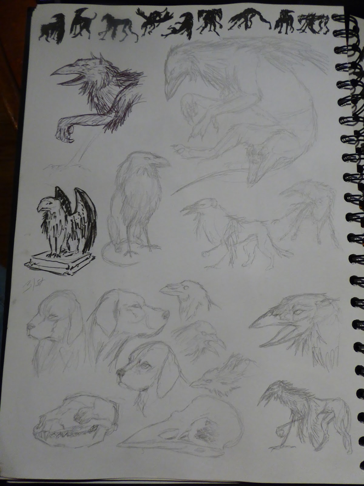
  • Research and reference images are key, especially kept on the page when drawing
  • Visual libraries count for a lot - I think the reason I had trouble with the last design was because it didn't fit anything I had drawn before

Potential Next Steps:
  • Find out what is best to have in a visual library for the most interesting creature designs
  • Explore combinations of creatures to apply visual library to (i.e. bison/cat, dog/oryx)
  • Look into mythological creatures and analyse the most common themes (i.e. wings, four legs) of popular and obscure creatures

Creature Design - Gravestone Beast and Daren Horley

Creature Design #9

Overview
Developed from a small silhouette I particularly liked, turned into a living/animated statue creature, carved by villagers as a protector that awoke in nightmares and turned on its creators.

I read an article featuring concept art, and the process thereof, of one of the creatures from 47 Ronin. Daren Horley was the artist responsible and his process was explained in the article, so I thought I'd try it. It involved silhouettes, and then greyscale mockups of a final design, with an hour or two spent on each one, before the final thing. Something I didn't try was using a parchment/paper texture to sketch on, to make it more interesting than a blank colour.

Research

  • Daren Horley's article on Creativebloq
  • Nightmare Frontier area on Bloodborne, for tombstone texture references
  • Rock textures (for an overlay layer)

Process
Digital silhouettes based on the idea caused by the top one (from my sketchbook). Looking for a shape for a statue/gravestone nightmare monster.


I took my favourite five silhouettes to the next stage, drawing details in grey over the top. The top two on the left have no overlay texture. By the third, I realised I was spending too much time on gaining an effective rock texture, so I overlaid a texture from google images on low opacity to add necessary variation much quicker. The two rightmost images were put together from amalgamating the best of the previous five designs.


The final image. A walking statue, carved like the gravestones, made as a protector. It bleeds gore from broken stones. Its limbs are covered in moss, mud, and blood.

Reflection
  • My favourite outcome of all of the recent creature designs
  • Using a photo texture in a sketch stage meant there was very little left by the end piece - normally I dislike using photo textures but this one was exceptionally useful and I may do it again in a similar case
  • Horley's method needs testing again with something less greyscale in the end result
  • Spending a few hours on each potential creature meant they were more developed than normal - it took time, but every detail added on them aided the final design
  • Small digital silhouette, scaled up, are easier to make than large ones straight off
  • Very good method for fleshing designs out first, instead of developing details later on


Sunday 3 January 2016

Creature Design - Werewolf and Hunter, and Andrew Mar

Creature Design #8

Overview
More a change in dynamics than a brand new creature - a hunter and a werewolf working together to hunt beasts.

I looked into Andrew Mar's ink style for this as a more viable alternative to Natalie Hall, as it seemed more doable. He has a skill for placing shadows in the ideal place in lineart drawings and it gives the image a great deal of impact.

Research

  • Andrew Mar's instagram
  • Bloodborne hunters (images)
  • Humans posed facing away (image references for proportions)
  • Wolves snarling (images)

Process
 
The idea was already fairly solid, and explored in previous sketches. These were to find a viable pose to display the relationship between the hunter and his acquired pet.

Chosen pose. They would fight at close quarters, with the werewolf lunging and being pulled back. The chain would eventually snap, so the werewolf would attack with claws from one side, and the hunter would use the remaining chain as a whip. The hunter's design is worn and ragged, showing his strength in surviving his monstrous pet.

Reflection
  • Gives a variety of line-widths to make the image more interesting
  • Can give a suggestion of shadows
  • Time-consuming, gives neat line-art
  • Took a while to find the pose, silhouettes are extremely useful in that regard
  • Waste of time if the final pose looks off or wrong


Creature Design - Church Griffin and Natalie Hall

Creature Design #7

Overview
In the Cathedral Ward of Bloodborne there are small griffin statues on pedestals, but the closest an enemy comes to that form is an obviously created dog with the head of a crow; my creature idea was a visible amalgamation of parts into a griffin-like animal, presumably failed and disturbing, and hidden away from the public.

The chosen artist was Natalie Hall, a tattoo artist who often posts animal sketches on her facebook page. She uses pencil and ink, and the results are normally fluid, exaggerated and sometimes in abnormal poses. During my initial sketches for ideas I drew a few creatures in the same kind of style and I thought it might be interesting to expand upon those.

Research

  • Natalie Hall's instagram
  • Fox hounds
  • Crows, ravens, and their skulls

Process
Initial exploration. Since the environment is typically a Victorian-style city, it seemed implausible for there to be lions or eagles. Thus, my ideas stayed with what existed in abundance in the world - dogs and crows.

I tried to use biro like Natalie Hall, which I quickly dropped in favour of pencil again. The small statue is a quick study of an in-game screenshot so I could get a feel for the creature I was designing, imagining the mindset of those who would be making it in the world.

Resorted to brushpen for quicker layouts for an end pose, as it helps me see the overall shape better than pencil lines do. Additionally, drawing in pen means each line counts, and has to be thought through a little more than pencil, as pencil has the option of being erased.

Several of the creatures are consigned to boxes to try and replicate Natalie Hall's style. 

Some poses worked well for forcing a sense of character (in particular, the one throwing feathers, and the one sat on its haunches), but they didn't work overall for displaying a creature's design, though it might be the wings that were at fault. Wings couldn't be folded on its back as it would hide too much of its body, but outstretched didn't fit in the constrained poses. 

The design developed at this stage, also. I went back to pencil, and then drew over it with a thinner brushpen just for line variety. The beak became more combined with the dog's skull, more in proportion with the placement of its nostrils.

Picked the best poses from the previous page and enlarged them, with more detail.

Final design for the Church Griffin. Deformed dog skull protruding into a muzzle, skin pulled back to the back of the jaws, feathers developing into a mane, wings too small to carry the creature in flight, and large crow-like fore-feet. Probably a mixture of hound bays and crow calls for its cry.


Reflection

  • Monochromatic designs don't give the same impact as coloured versions
  • Pencil/pen work great for sketches
  • Different poses, especially constrained to a small area, make for visible personalities in the creatures
  • Multiple sketches really help to develop a design
  • Basing the design in the world and using what would be available (for a chimeric creature like this one) helps to give a more realistic outcome