Tuesday 11 October 2016

Models

[Unfortunately I do not have any in-progress photos of these models.]


Mharos/Yule Cat model. Made of Citadel/Kneadetite Green Stuff, a two-part putty that forms into slowly hardening plastic. It is built over an armature covered in tinfoil, then covered in green stuff, and detailed/smoothed with a scalpel that I have become much more capable with. Green stuff itself is mildly unpleasant to work with after Chavant clay and Super Sculpey. It is sticky, requiring frequent lubrication with water, and does not bond extremely well to itself, leaving noticeable ridges I had to try and plane down with my scalpel. With the tools I had at my disposal though, I am extremely pleased with how this model turned out.
 

Initial sketches for the end model. It felt necessary to make the creature able to stand up of its own accord, so the stronger tail was used instead of trying to make it balance its weight on the fairly spindly legs.


Flesh-toned Super Sculpey of a Celestial Stag. The detailing of it was extremely tedious, but very rewarding as it brought the whole model together. One of the legs and one antler frequently snapped, requiring patching up and re-baking in the oven to harden the sculpey. For my first go with the material I am pleased with the turn out but it was extremely aggravating to re-bake after small changes and then have to wait for it to cool down enough to be used again.

The two different materials have increased my knowledge of modelling. I think I will be much more capable with Chavant clay now as it is not as loose as these materials when they are malleable, and it holds its weight a lot better. Green stuff is a fun, if annoying, material. I really like the effect that painting can give to it as a final model, too, so that might be something I return to in the future. Super Sculpey, perhaps. Maybe not for everything, but anything that specifically requires being hard in a certain pose would definitely benefit from sculpey. Chavant's capability to be altered at any point is definitely most useful for reference models though, allowing for different poses and with less of a shiny texture so that lighting might be more accurate in the piece.

Sunday 9 October 2016

Seascape


Based on a Sea Leviathan attacking a group of Akhlut. The thumbnail was drawn from a photo I took in Ingleton Falls, for the texture I could see in the rocks. Moving from long images to A5 hurt the composition a little but quickly came through again.


Partially phototextured. Every major part is on a separate layer for ease of change but the overlayed white seafoam complicated things a little. It was very fast to complete though, compared to the others. The idea was solid and it was mainly environment details more than difficult creature textures or poses.


Final. The seaweed at the front does not look entirely as I wanted, but the colours are pleasant and it does look rather like it fits in at the ocean. The Sea Leviathan takes main focus and the Akhlut running are noticed second. I had wanted something to show the scale of the Akhlut compared to humans, as well, for a better sense of scale, but I could not happily find somewhere to fit that in. Instead, scale has to be based on the Leviathan and the Akhlut alone, but it does show the significant difference between them and that works as the main element of the piece.

Friday 7 October 2016

The Chase

This image moved through various thumbnails looking for a solid visual impact. I wanted the focus of this image to be the scale of the Roc compared to the feline Talian, who is also huge in comparison to a human. The humans of the piece are what keep the scale in line. The original thumbnail did not give the correct impact, but the other explorations went away from this idea and then returned to its general theme as it fitted the scenario best.


This is the mid-way point, before detailing. Lighting was sorted, with the shadow of the Roc laying over the rear of the Talian in a threatening manner. The actual pose of the cat and the bird took an extremely long time to entirely figure out but a lot of references finally solved this. I had originally wanted to model the pose but references would have been necessary for that anyway.


The final image. I don't know that the shade over the Talian entirely comes through as being caused by the great size of the Roc, but I don't know how to fix that. Lighting has become an interesting point to look into though, and this exploration has made me more confident with my knowledge of it thus far. The character is Joy, the Talian is Stagger, and they were drawn from their orthographic poses I created. It is a breakthrough in my human rendering, and even the pose and anatomy felt easier after this MA year. Though an intimidating piece to plan, it was very fun to colour and render through to this point.

Sunday 2 October 2016

Sunlit Rykos

Riding the highs of completing the last challenging piece - the unicorn versus the werewolf - I went for more complicated lighting, but with a main subject that I understood. Thus I went for a Rykos (my horned dog creature) as I knew I could get a good, recognisable pose with solid references of actual dogs, giving a clear visual insight into its personality.


This image is very similar to previous sketches, just mildly more detailed. The horns needed the clay model for perspective as I could not figure out exactly where each part would appear. The lighting is very basic and for a while I was happy with this image until I considered it against the previous, and decided to return to it and find a solid lighting reference to imitate.
 

This final image is A5, and is what made me return to the unicorn piece to resize, so that they would match. The light is much more dramatic, with forced perspective from the blurred leaves close to the camera. The flipped image felt best of the two, and I really like the outcome. Even though it is not fully realistic (I am not entirely happy with the horns but suspect I just need more practice with them) I am very pleased with what I managed to achieve for a more rendered version of my creature.

Thursday 29 September 2016

Werewolf Hunting

This illustration started mid-way through the artbook, drawn from comments by a tutor about subverting mythical animals, "such as a unicorn fighting a werewolf over prey". As my world featured unicorns, it was easy to slot my remade werewolf (from a previous semester) into the lore and have them come face to face. Although the unicorn looks ferocious, it is built to solely hunt werewolves and keep other denizens of the forest safe from their disease.

The image is built on the idea of a wildfire streaming across the tar pits and into the deep forest, driving all animals into close odds. The werewolf is a creature of spite and hate, attacking anything in its path, while the unicorn is an avenging god of the forest. The scene is intended to capture the sheer strength of the unicorn pushing its foe away, and the vicious, unnatural capacity of the werewolf to survive even when horrendously wounded.


It took an extremely long time to create. Built from a clay model (which was in itself modelled based on results from previous models of both creatures), the background was made first and then as the pose of the creatures changed, I was unwilling to change the background quite as much as I probably should. Figuring out how to turn the reference model into a fitting section of the image was difficult, and took a very long time; this image was dropped from the artbook in favour of finishing it afterwards without as much time constraint, allowing me to fully explore the possibilities of the image.

It is a new scene for me, a dynamic pose with a lot of strong, vivid lighting, silhouetting the animals against the skyline. I'm proud of what I managed to achieve with this image, as it pushed all of my skills and forced me to figure out responses to problems in the development that I didn't even expect to come up. The reference model became less of an exact thing, but was very useful for basic lighting and moving poses without worrying the perspective was wrong.


The final image was long, the same size as my three environments, as it was what I had learnt to make in the Jonas De Ro tutorial I took to heart, which kickstarted my interest in environments. For this project I wanted A5 results so I moved parts around into an A5 boundary. I think the longer image looks more dramatic but the A5 is better focused on the action of the piece, which is beneficial.


Wednesday 21 September 2016

Into the Endgame

Since my last update I have been working on creating an artbook for my final project, bringing together all the elements I have picked up from previous experiments to develop a world populated by a number of creatures. I had fully intended to make a post during the middle to show the process, but I kept pushing it aside in order to concentrate on whatever part I was working on that day.


My book consists of three parts. The first looks at past experiments from this year, explaining a little about them and what I learnt about from their completion. It ends with a page of final thoughts, and a conclusion drawn about the best practice approach. Essentially, it states that learning and branching out as much as possible allows you to find things that work for your own subjective tastes, and this grants you confidence in your work in order to do better. I found that simply doing is better than over-analysing or aiming for perfection, as it allowed for failure or successes to be worked through and learnt from, whatever happens.


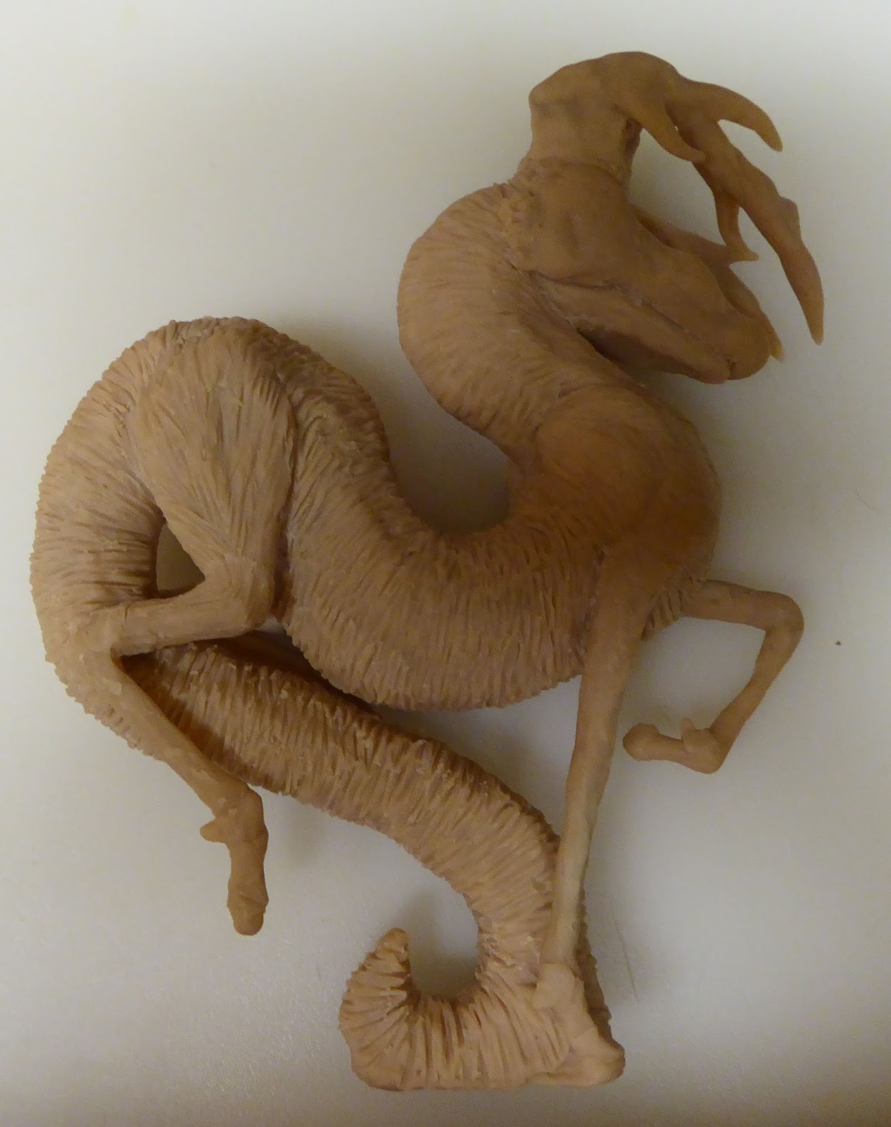
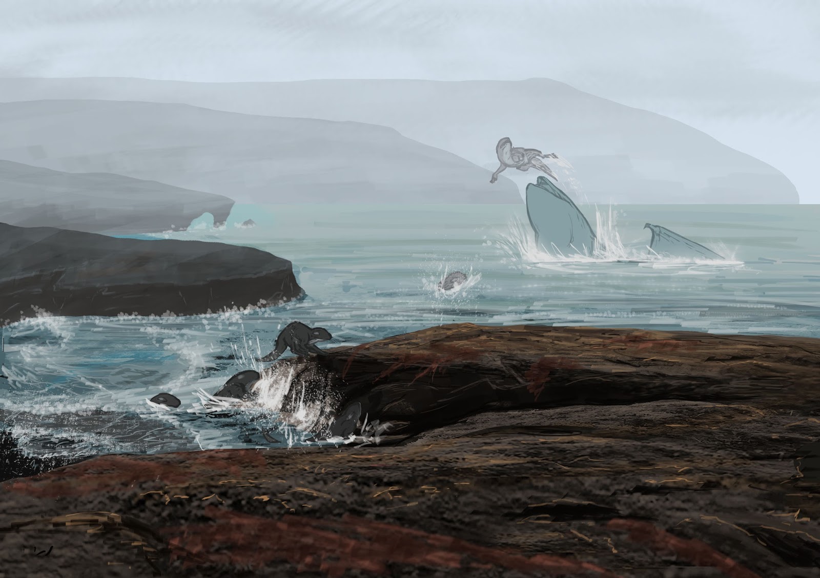
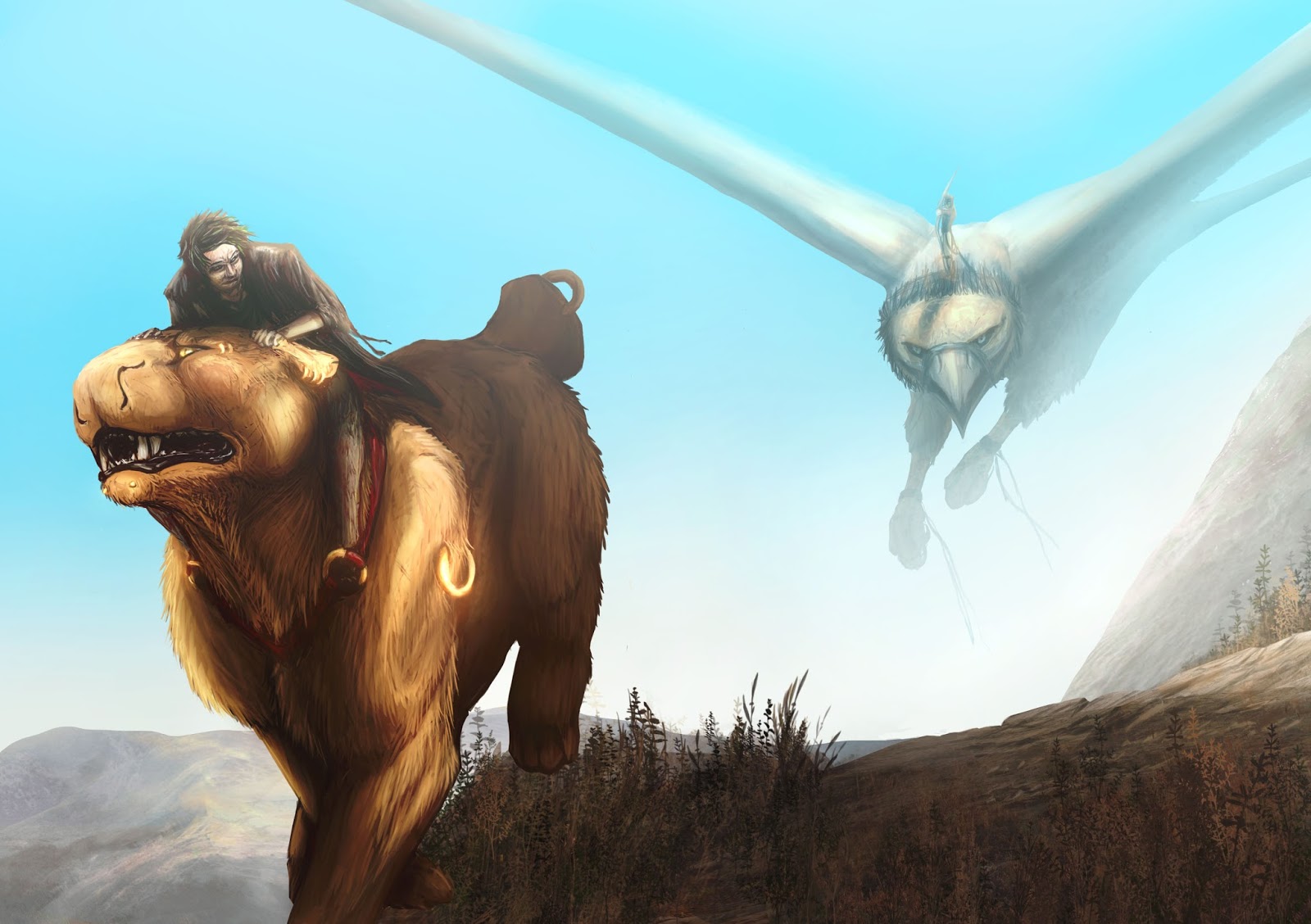
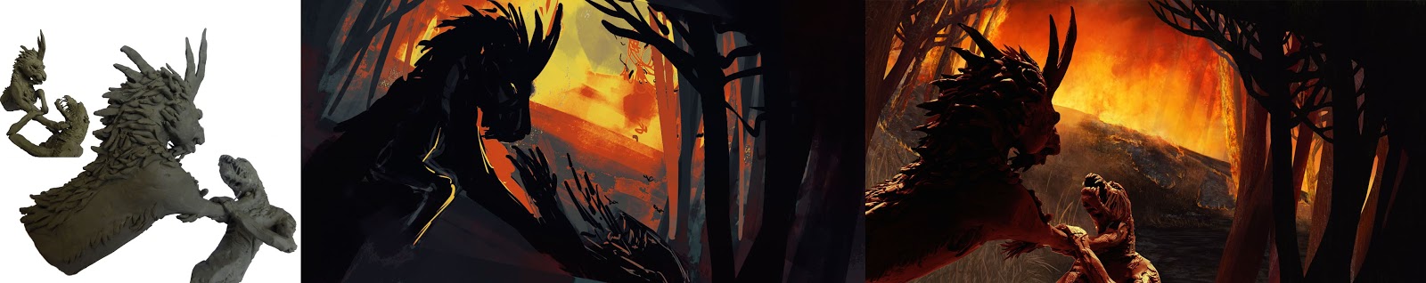
The second part introduced the world, a land scarred by valleys and extreme seasons. Gunpowder doesn't exist, so weapons are restricted to bows and blades. Mounts are used for this reason, giant Rocs and Talians (a large cat-like breed) that work alongside man in savannah cities. I completed a few environments and spoke about the process, including the use of clay models for any animals in the scene.


I also developed three characters (alongside an animal companion) who were the major players within the world's plot. Humans and environments were not a strength of mine, but working on the latter over the course of this year encouraged me to try to combat my other weakness. While I would not claim any proficiency in their designing, I am much happier to try than I was before. I learnt a lot from their design process and although it took a long time to complete them (and pushed my book timings out of whack a little bit, forcing more intricate time management) I am quite pleased with the result, and am looking forwards to working on this part of my skill-set in the future.


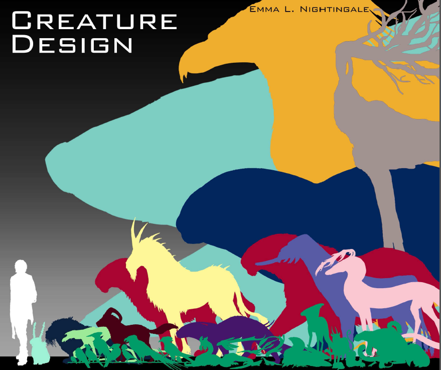
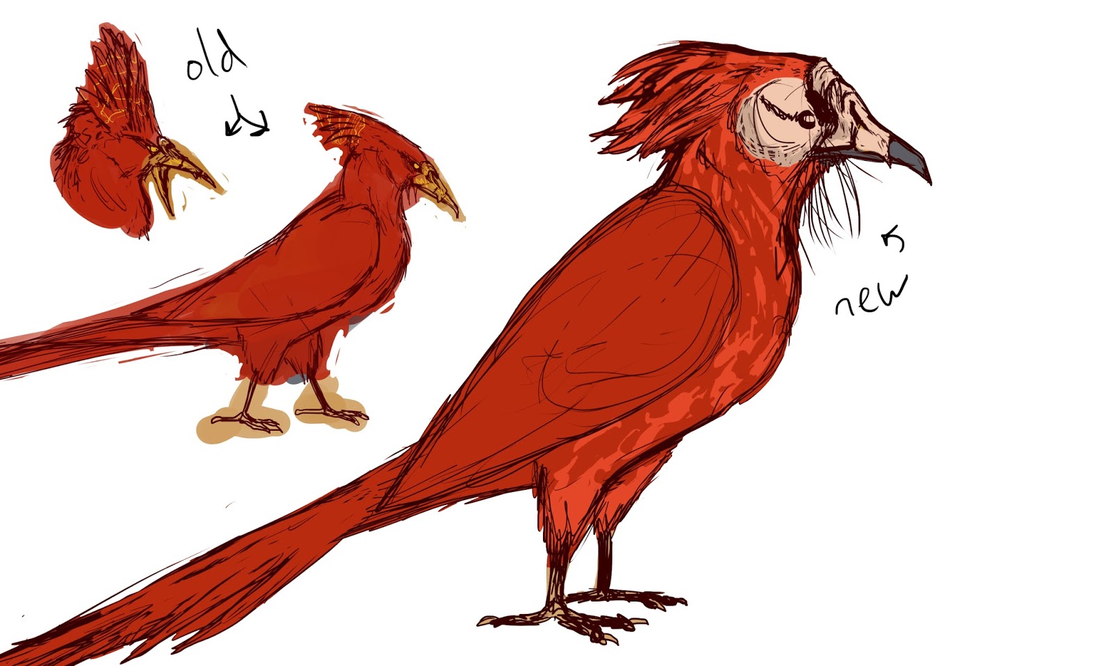
The final and largest section of my book was obviously the creature designs. It begins with four watercolour studies of the main animal types - mammals (primarily small, since I hadn't drawn them before), cold-blooded (reptiles, amphibians, fish), insects, and birds. These were done to learn the shape language of the creature group and create a few small animals to flesh out the world, rather than only concentrating on the big animals. It was a technique I picked up in previous experiments and definitely helps me to learn a shape or form more than digital would.


After the studies come several pages worth of small animals. Ten birds, eight insects, eight coldbloodeds, and thirteen little mammals. Each is named and has a small amount of text about their place in the world. Some of them have relationships with one another, such as Springbud insects gathering on the Vinbower snake in order to add to its camouflage, in return for protection from birds that would eat them. These small animals gave more credence to the world and its predators, granting them something to hunt and altering my perception of them into a more realistic and developed form. The horned dog, Rykos, became a more playful and wide-ranging hunter due to the influx of small animals that it could chase, even if it didn't always intend to catch them.


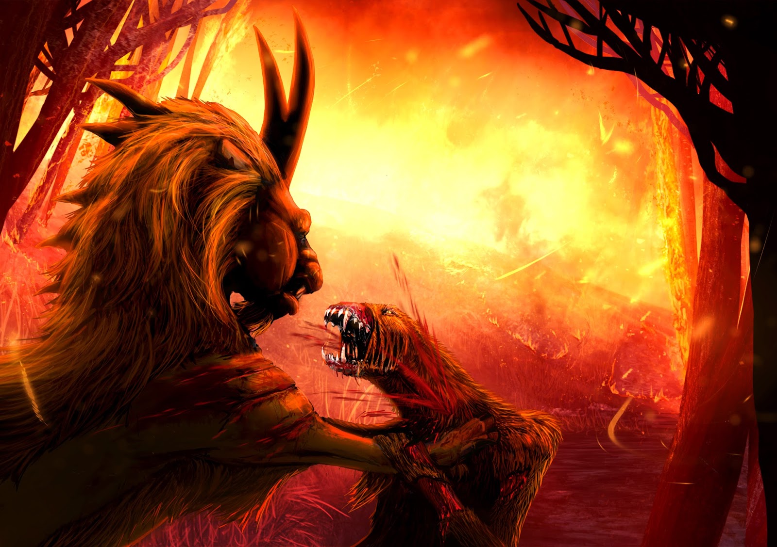
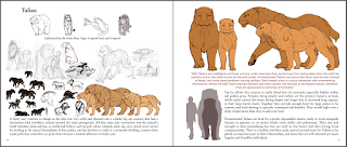
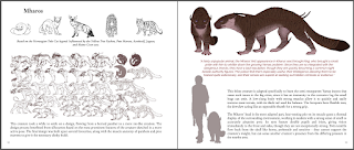
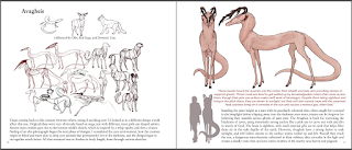
Beyond the studies came the main content; sketches and information about a number of big creatures. It falls in a simple layout. Each has small sketches of the main inspiration for the animal, and others that might have influenced an aspect of its design. Below that are sketches (traditional (scanned), or digital) and some text about how the design went, whether it was difficult or fun, and what I learnt from the process.

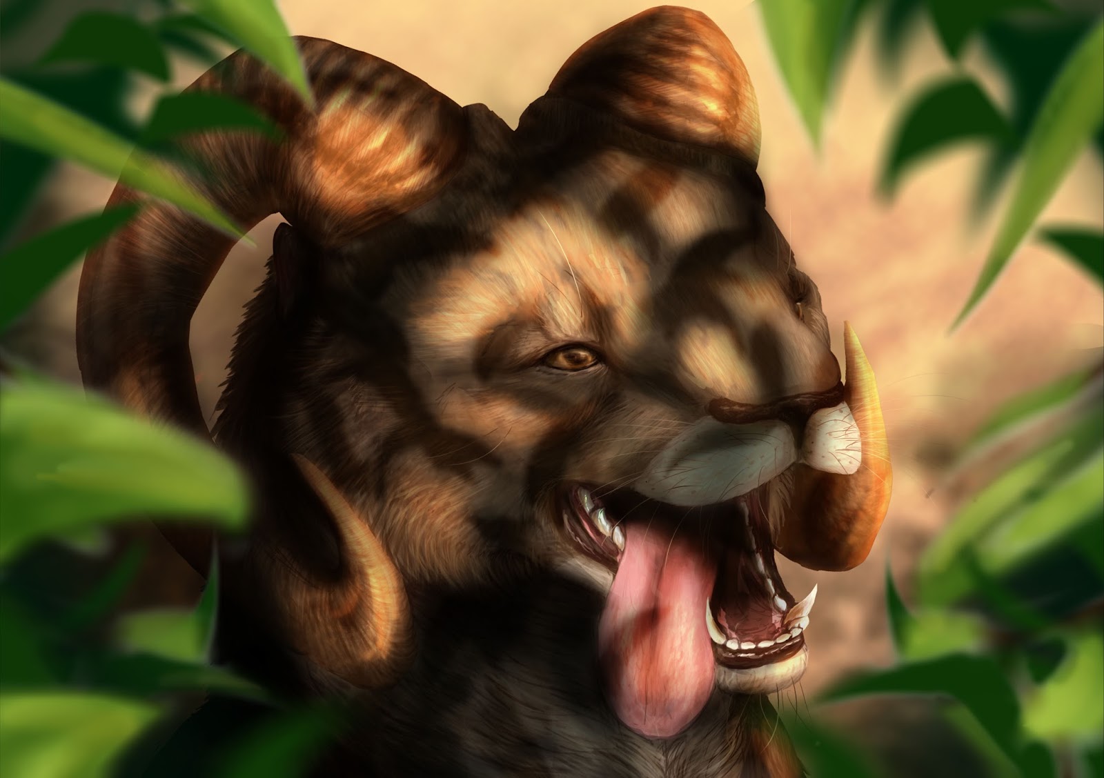
On the right page is a front and side orthographic of the creature in flat colours, which were extremely useful to create as front views tended to be something I would avoid. It really gave a better picture of the animal, and added to each one's character. Beneath this is red text giving a flavour of the animal in its environment, how people in the world might react to it, and how it interacts with other species, Below that comes black text that explains design points in a more detailed manner, such as the male Talian having large lung capacity with which to dive in savannah lakes, where its bulk is less of an obstacle than it would be on land.


The book took long to complete than I anticipated. The human characters over-ran, as I wasn't happy with their design for a long time, and one of the environments (which eventually ended up being put aside in favour of finalising other parts of the book) took an incredibly long time to develop, especially the model part of it and then the integration of said model into the image. It was a learning curve, and I picked up how to better balance the two halves of an image from working with it.

Within the book, I concluded my research into the best practice approach. Essentially, I decided, it depends on the person. You can learn from tutorials and observation and such, but you need the motivation to continue through mistakes and difficulty, and determination to learn from any source, even if it leads to a dead end and doesn't influence your art style in the long run. I'm sure that the best practice approach is mental, rather than a physical method of working (which I had initially expected at the beginning of this entire project), since actual art styles are subjective and dependent on the person. The willingness to learn just from the process of doing was my main take-away, and I have undertaken a few minor pieces in this space between book completion and final hand-in, in order to challenge myself further with what I can learn.


Wednesday 29 June 2016

Affected by Research

I've been working on a number of creatures over the past month, alongside learning how to create effective environments, figuring out how to manipulate and sculpt small models, and increasing my knowledge of composition. Separate updates will resume for each creature once a proper layout has been solidified.

However, this particular entry is to briefly remark upon how research into my own design process and work ethic aided me when I was beginning to flag and hitting something of an art block. I'd noted in essays how 'designing through play' was particularly useful, keeping sketches loose and interesting and free, but I had a day where my art began to slow, and neat lines suddenly seemed the only important thing. In the past, I would have stopped drawing until this freedom and enjoyment of art came back of its own accord, but because I recognised it as a failure to keep the idea of 'play', I took a break from my creature design and sketched freely on a new document, which greatly re-energised the creature design I returned to afterwards.

I need to retain freedom for initial sketches and only become neater for the following lineart once a design has been set, not restrict myself to neat lines from the start. Acknowledgement of this issue and providing a solution has, I feel, greatly enhanced my ability to create art.

Initial sketch for a phoenix. Very stilted and typical. Based on sketches but tried too hard to utilise all of them.

Free sketch. Consists of my and my friend's pets chasing a tennis ball, with movement and humour being the intent.

Current phoenix. Freer and looser than the last, with potential for refining.